Data Visualization in R Using ggplot2 - Module 1
Show the code
Warning: package 'ggplot2' was built under R version 4.5.2
Warning: package 'tibble' was built under R version 4.5.2
Warning: package 'tidyr' was built under R version 4.5.2
Warning: package 'readr' was built under R version 4.5.2
Warning: package 'purrr' was built under R version 4.5.2
Warning: package 'dplyr' was built under R version 4.5.2
── Attaching core tidyverse packages ──────────────────────── tidyverse 2.0.0 ──
✔ dplyr     1.2.0     ✔ readr     2.1.6
✔ forcats   1.0.1     ✔ stringr   1.6.0
✔ ggplot2   4.0.2     ✔ tibble    3.3.1
✔ lubridate 1.9.4     ✔ tidyr     1.3.2
✔ purrr     1.2.1
── Conflicts ────────────────────────────────────────── tidyverse_conflicts() ──
✖ dplyr::filter() masks stats::filter()
✖ dplyr::lag()    masks stats::lag()
ℹ Use the conflicted package (<http://conflicted.r-lib.org/>) to force all conflicts to become errors
Show the code
'data.frame':   30 obs. of  2 variables:
 $ weight: num  4.17 5.58 5.18 6.11 4.5 4.61 5.17 4.53 5.33 5.14 ...
 $ group : Factor w/ 3 levels "ctrl","trt1",..: 1 1 1 1 1 1 1 1 1 1 ...
Show the code
Show the code
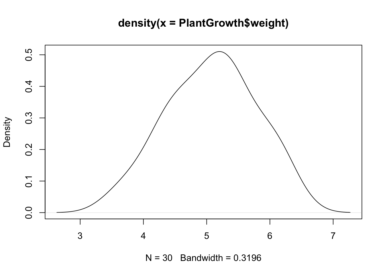
plot(density(PlantGrowth$weight)) # Density plot using base R
Show the code
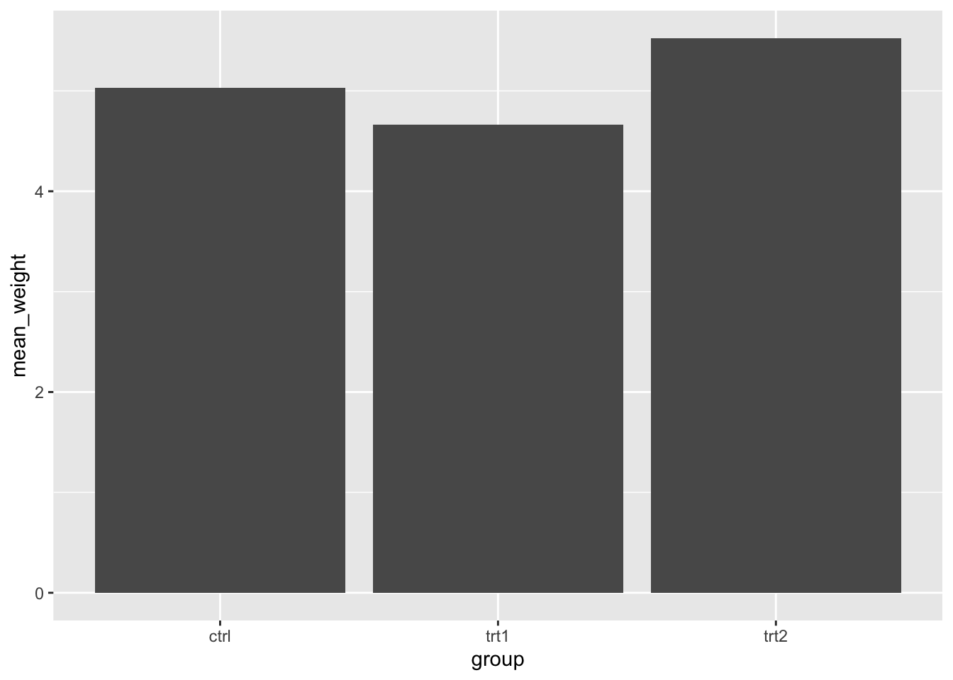
  PlantGrowth_grouped <- PlantGrowth %>%                    # Group data using dplyr
  group_by(group) %>%
  summarize(mean_weight = mean(weight))
PlantGrowth_grouped
# A tibble: 3 × 2
  group mean_weight
  <fct>       <dbl>
1 ctrl         5.03
2 trt1         4.66
3 trt2         5.53
Show the code
ggplot(data = PlantGrowth_grouped,                        # ggplot2 bar chart
       aes(x = group,
           y = mean_weight)) +
  geom_col()
Made with 🧠 and Quarto by Colin Madland.