Data Visualization in R Using ggplot2 - Module 3
Show the code
Warning: package 'ggplot2' was built under R version 4.5.2
Show the code
'data.frame':   60 obs. of  3 variables:
 $ len : num  4.2 11.5 7.3 5.8 6.4 10 11.2 11.2 5.2 7 ...
 $ supp: Factor w/ 2 levels "OJ","VC": 2 2 2 2 2 2 2 2 2 2 ...
 $ dose: num  0.5 0.5 0.5 0.5 0.5 0.5 0.5 0.5 0.5 0.5 ...
Show the code
Show the code
Show the code set.seed ( 54698 ) # Seed for reproducibility
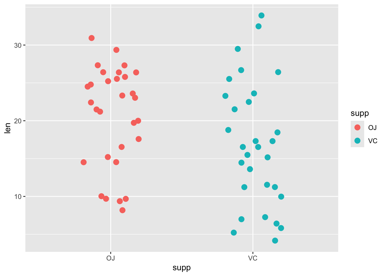
Show the code ggplot ( data = ToothGrowth , # Mapping supp to color aes ( x = supp ,
y = len ,
color = supp ) ) +
geom_jitter ( width = 0.2 ,
size = 3 )
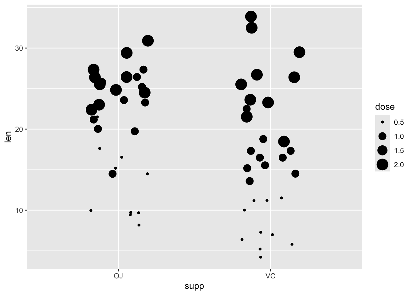
We can move the size argument to be within the aes()
Show the code ggplot ( data = ToothGrowth , # Mapping dose to size aes ( x = supp ,
y = len ,
size = dose ) ) +
geom_jitter ( width = 0.2 )
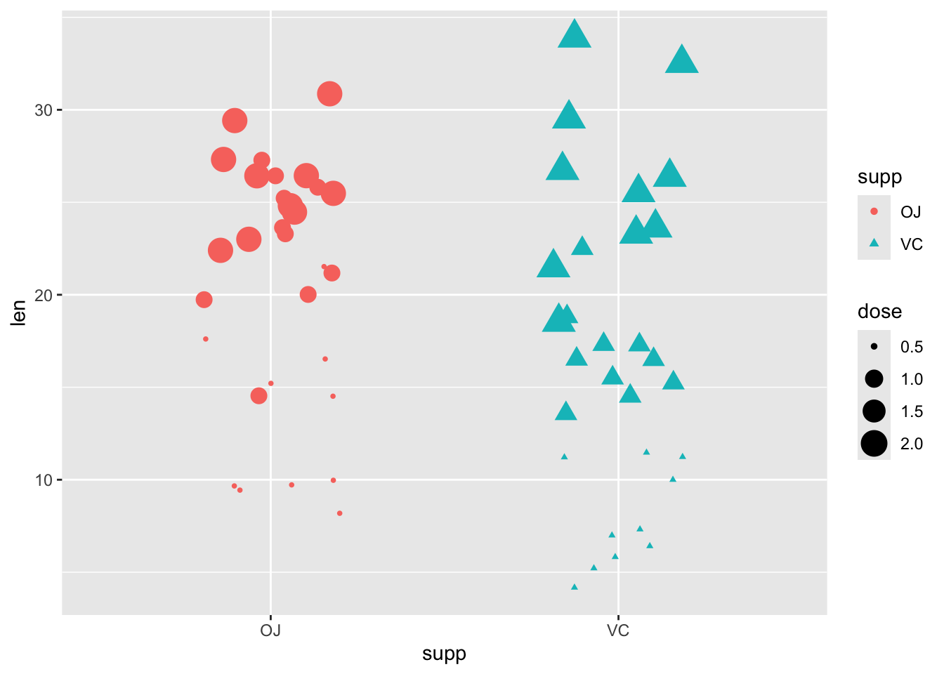
Also possible to combine aes()
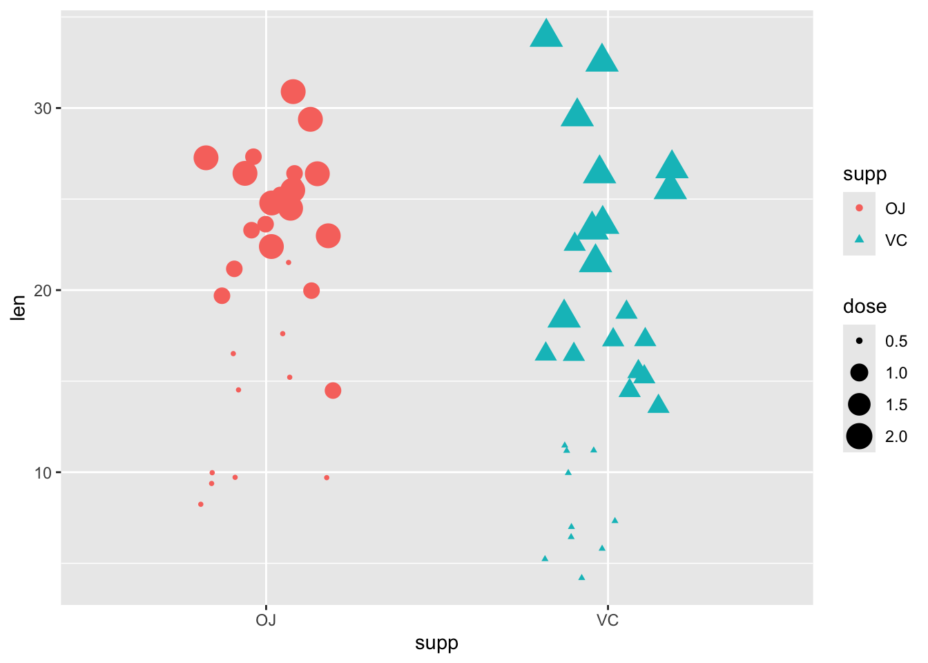
Show the code ggplot ( data = ToothGrowth , # Combined aesthetic mapping aes ( x = supp ,
y = len ,
color = supp ,
shape = supp ,
size = dose ) ) +
geom_jitter ( width = 0.2 )
Or, map the aes() geom() function…note the second call to aes() geom_jitter()
Show the code ggplot ( data = ToothGrowth , # Mapping inside geom aes ( x = supp ,
y = len ) ) +
geom_jitter ( aes ( color = supp ,
shape = supp ,
size = dose ) ,
width = 0.2 )
Exercises
In this module, we continue working with the ggplot2 package and the airquality data set used in the previous module. To ensure accurate visualization, we first need to install and load the ggplot2 package. Additionally, we will convert the Month column in the airquality data set to a factor class to treat it as a categorical variable for visualizations.
Show the code # install.packages()("ggplot2") Install & load ggplot2 library ( ggplot2 )
data ( airquality ) # Load example data
airquality $ Month <- as.factor ( airquality $ Month ) # Convert Month to factor
Now, we can move on to the exercises of this module:
Set a random seed using set.seed(75188) for reproducibility.
Show the code
'data.frame':   153 obs. of  6 variables:
 $ Ozone  : int  41 36 12 18 NA 28 23 19 8 NA ...
 $ Solar.R: int  190 118 149 313 NA NA 299 99 19 194 ...
 $ Wind   : num  7.4 8 12.6 11.5 14.3 14.9 8.6 13.8 20.1 8.6 ...
 $ Temp   : int  67 72 74 62 56 66 65 59 61 69 ...
 $ Month  : Factor w/ 5 levels "5","6","7","8",..: 1 1 1 1 1 1 1 1 1 1 ...
 $ Day    : int  1 2 3 4 5 6 7 8 9 10 ...
Exercise 2
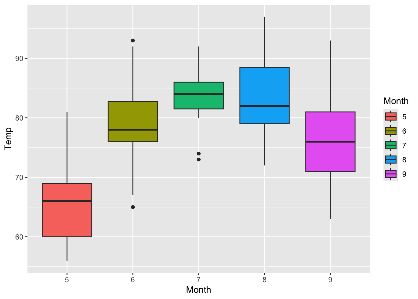
Map the Month column to the x-axis and the Temp column to the y-axis. Use a geom_boxplot() layer to create a boxplot.
Add the fill aesthetic mapping to the Month column in the boxplot created in the previous exercise.
Exercise 4
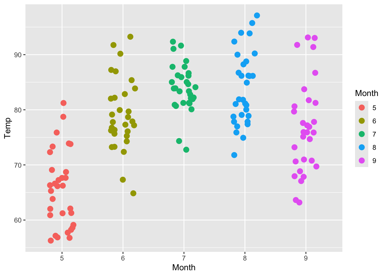
Map the Month column to the color aesthetic, and use geom_jitter() to create a jitter plot. Adjust the width to 0.2 and the size to 3.
Show the code airquality $ Month <- as.factor ( airquality $ Month ) ggplot ( data = airquality , aes ( x = Month ,
y = Temp ,
color = Month ) ) +
geom_jitter ( width = 0.2 ,
size = 3 )
Exercise 5
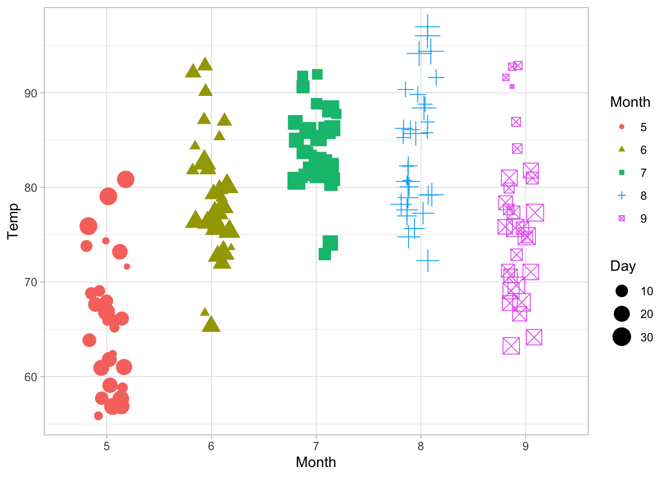
Combine multiple aesthetic mappings: map Month to color and shape, and map Day to size. Use geom_jitter() with a width of 0.2.
Made with 🧠 and Quarto by Colin Madland.