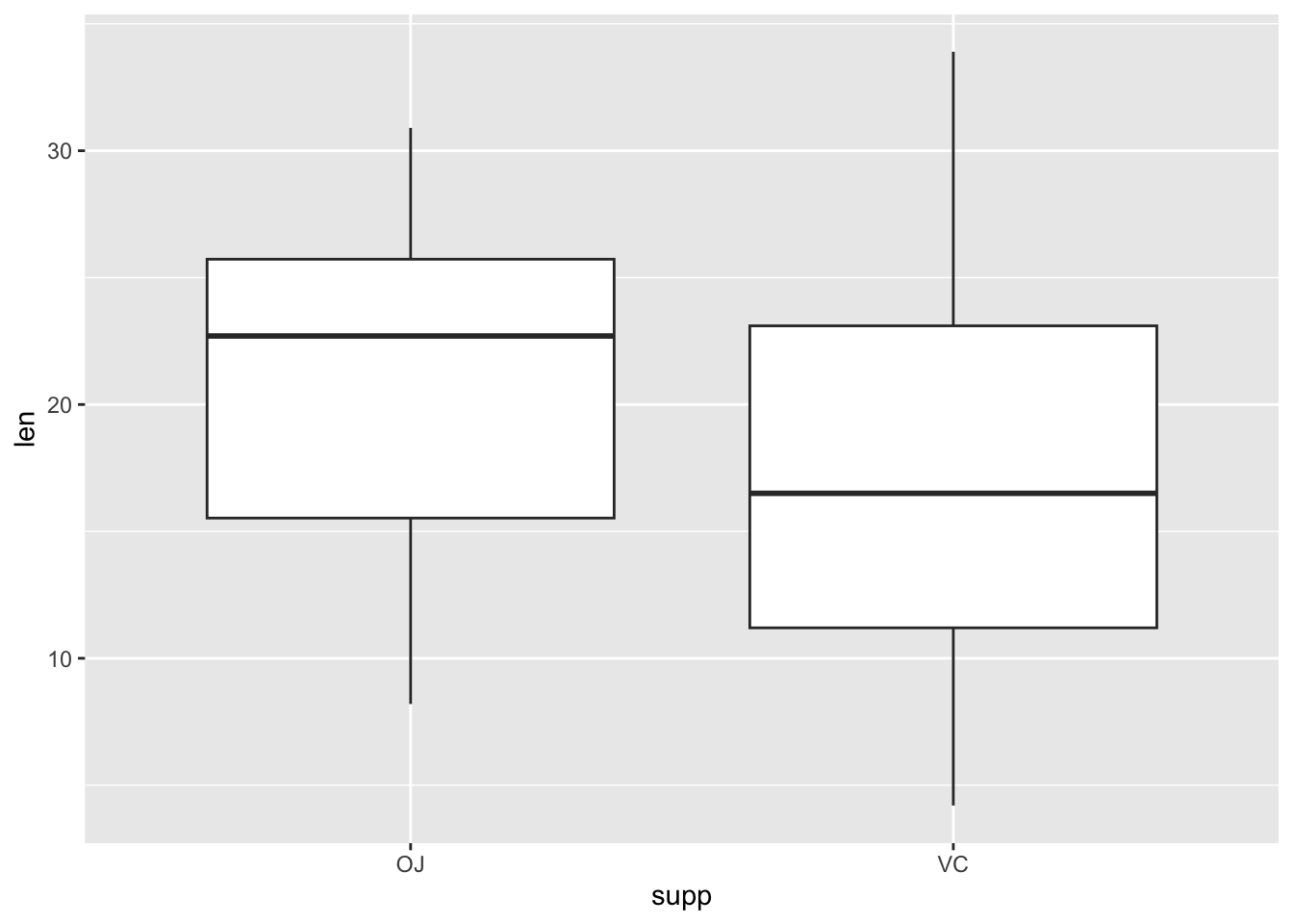
data(ToothGrowth)# Load example dataggplot(data =ToothGrowth, # Basic Boxplotaes(x =supp, y =len))+geom_boxplot()
Add a layer of data points to the boxplot layer.
Show the code
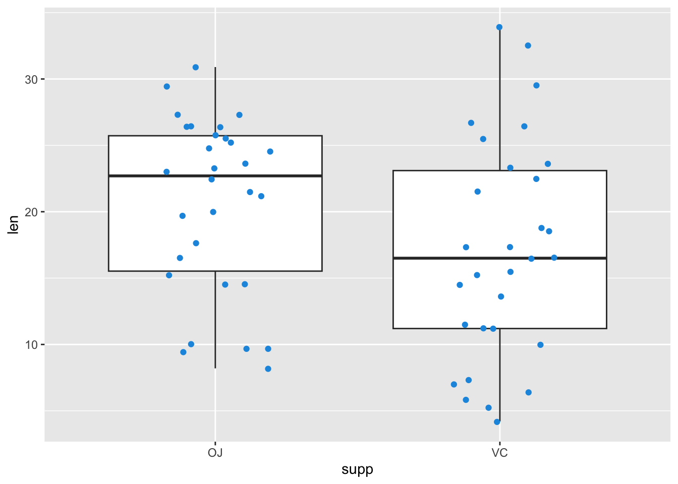
ggplot(data =ToothGrowth, # Overlay jittered pointsaes(x =supp, y =len))+geom_boxplot()+geom_jitter(width =0.2, color ="#1b98e0")
Show the code
my_ggp1<-ggplot(data =ToothGrowth, # Save plot in data objectaes(x =supp, y =len))+geom_boxplot()my_ggp1# Draw plot in data object
Add a layer to the plot object…
Show the code
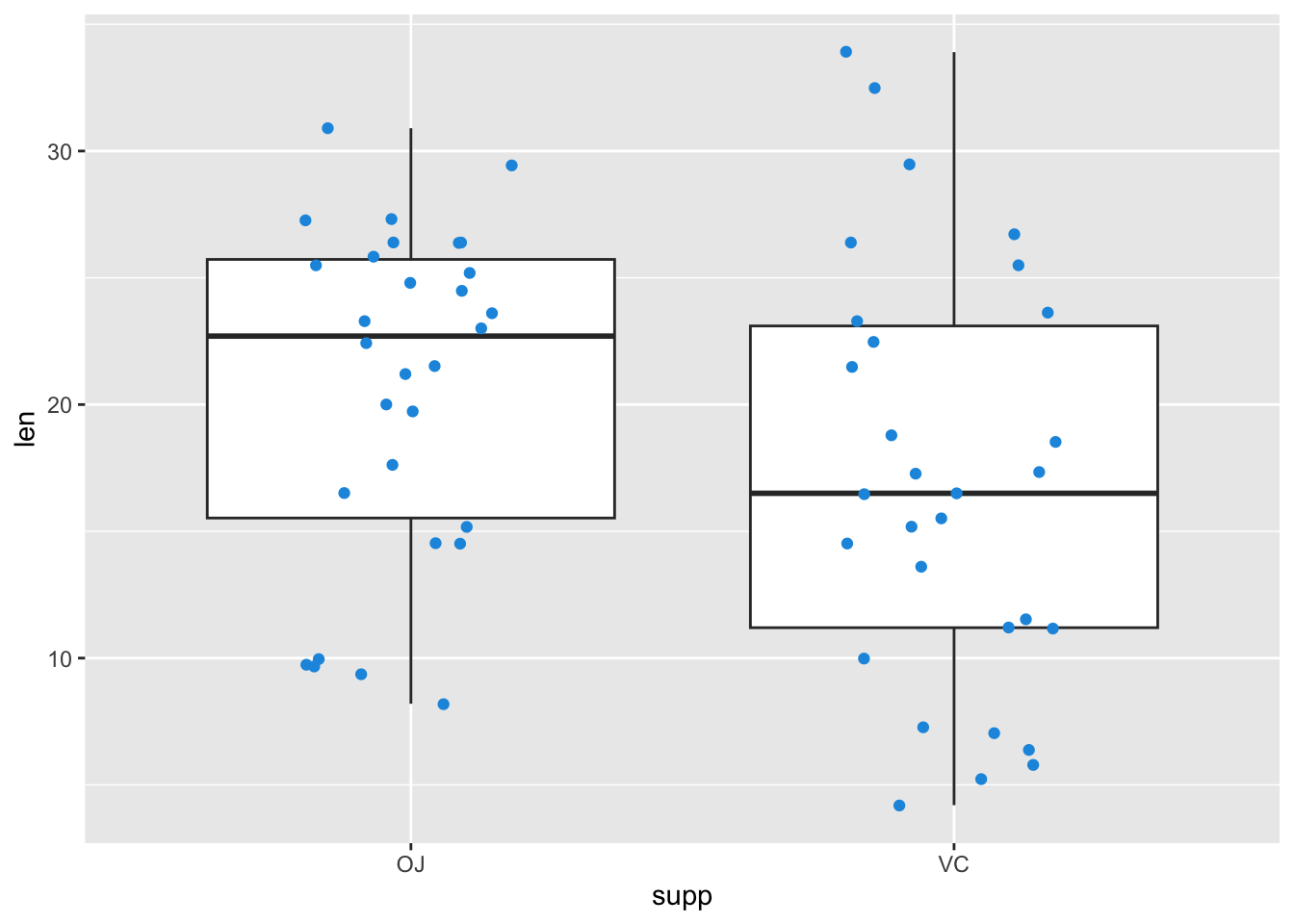
my_ggp1+# Add layer to data objectgeom_jitter(width =0.2, color ="#1b98e0")
Save as new object…
Show the code
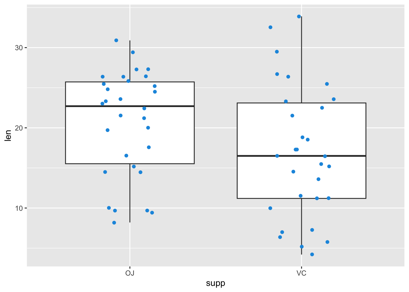
my_ggp2<-my_ggp1+# Create new data objectgeom_jitter(width =0.2, color ="#1b98e0")my_ggp2
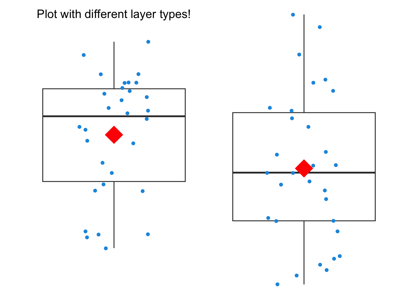
Adding different layer types
Show the code
my_ggp2+# Different layer typesstat_summary(fun =mean, geom ="point", color ="red", size =10, shape =18)+annotate(geom ="text", x =1, y =34, label ="Plot with different layer types!", size =5)+theme_void()
Exercises
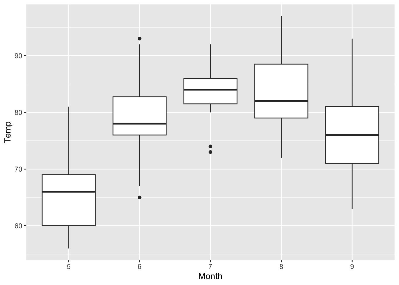
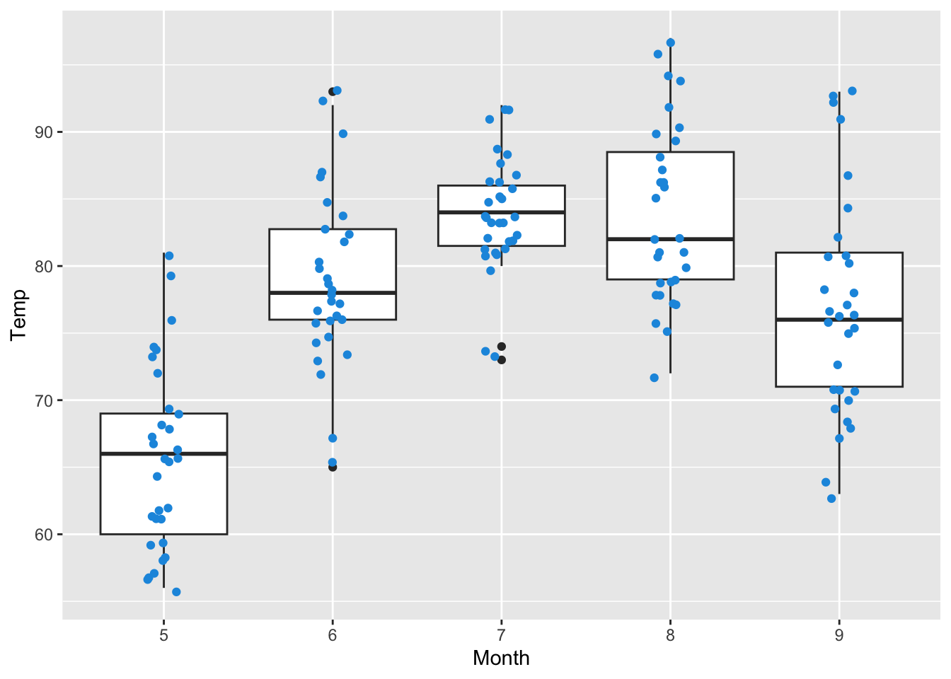
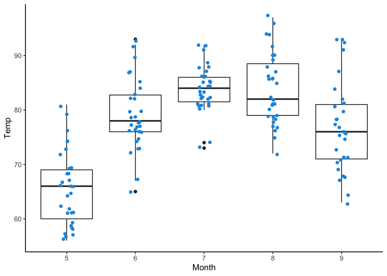
In this module, we will build on the airquality data set introduced earlier. To prepare, we will install and load the ggplot2 package, convert the Month column to a factor class to use it as a categorical variable, and set a random seed for reproducibility.
Show the code
airquality$Month<-as.factor(airquality$Month)# Convert Month to factor
Create a boxplot mapping the Month column to the x-axis and the Temp column to the y-axis. Save the plot as a data object named my_ggp3 and display the plot.