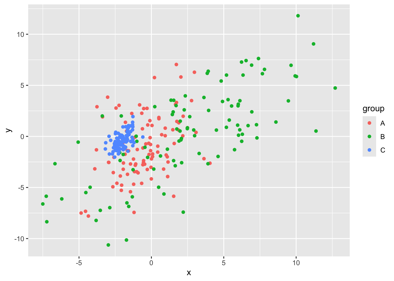
Multiplot Layouts Using Facets

ggplot2
tidyverse
statsglobe
R
facets
Author

Colin Madland

Published

January 18, 2025

Data Visualization in R Using ggplot2 - Module 5

library(ggplot2)
library(tidyverse)
── Attaching core tidyverse packages ──────────────────────── tidyverse 2.0.0 ──
✔ dplyr     1.1.4     ✔ readr     2.1.5
✔ forcats   1.0.0     ✔ stringr   1.5.1
✔ lubridate 1.9.3     ✔ tibble    3.2.1
✔ purrr     1.0.2     ✔ tidyr     1.3.1
── Conflicts ────────────────────────────────────────── tidyverse_conflicts() ──
✖ dplyr::filter() masks stats::filter()
✖ dplyr::lag()    masks stats::lag()
ℹ Use the conflicted package (<http://conflicted.r-lib.org/>) to force all conflicts to become errors
set.seed(91755)                                           # Seed for reproducibility
x <-- c(rnorm(100, mean = 0.5, sd = 2),                    # Create synthetic data
       rnorm(100, mean = - 3, sd = 4),
       rnorm(100, mean = 2, sd = 0.5))
y <-- c(rnorm(200, mean = 1, sd = 3),
       rnorm(100, mean = - 1, sd = 0.7)) +
  0.7 * x

Create dataframe called my_data and create 3 groups and 4 subgroups

my_data <- data.frame(x = x,
                      y = y,
                      group = rep(LETTERS[1:3], each = 100),
                      subgroup = sample(letters[1:4], size = 300, replace = TRUE))
view(my_data)

Create scatterplot with each group a different colour

ggplot(data = my_data,                                    # Scatterplot without facets
       aes(x = x,
           y = y,
           color = group)) +
  geom_point()

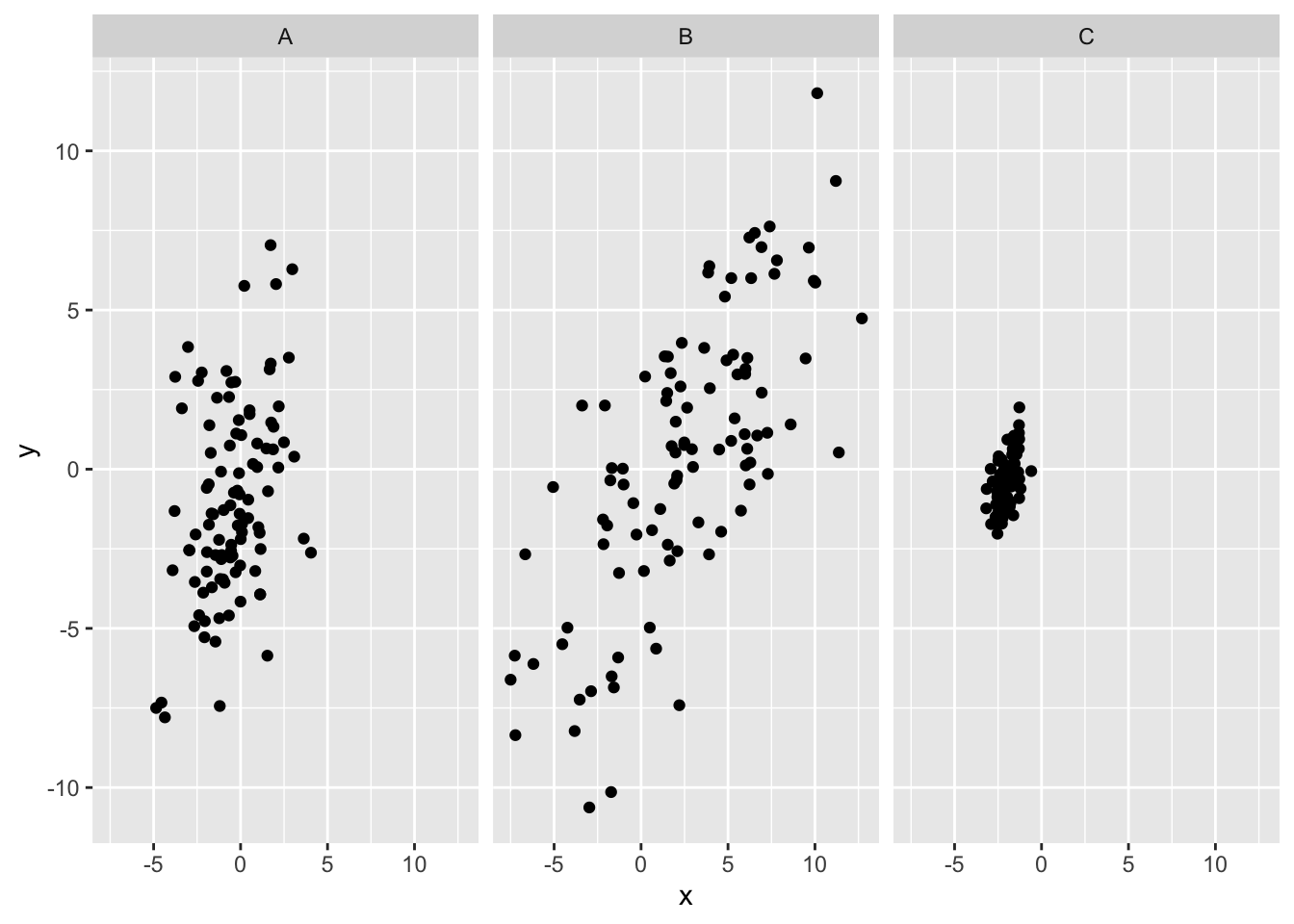
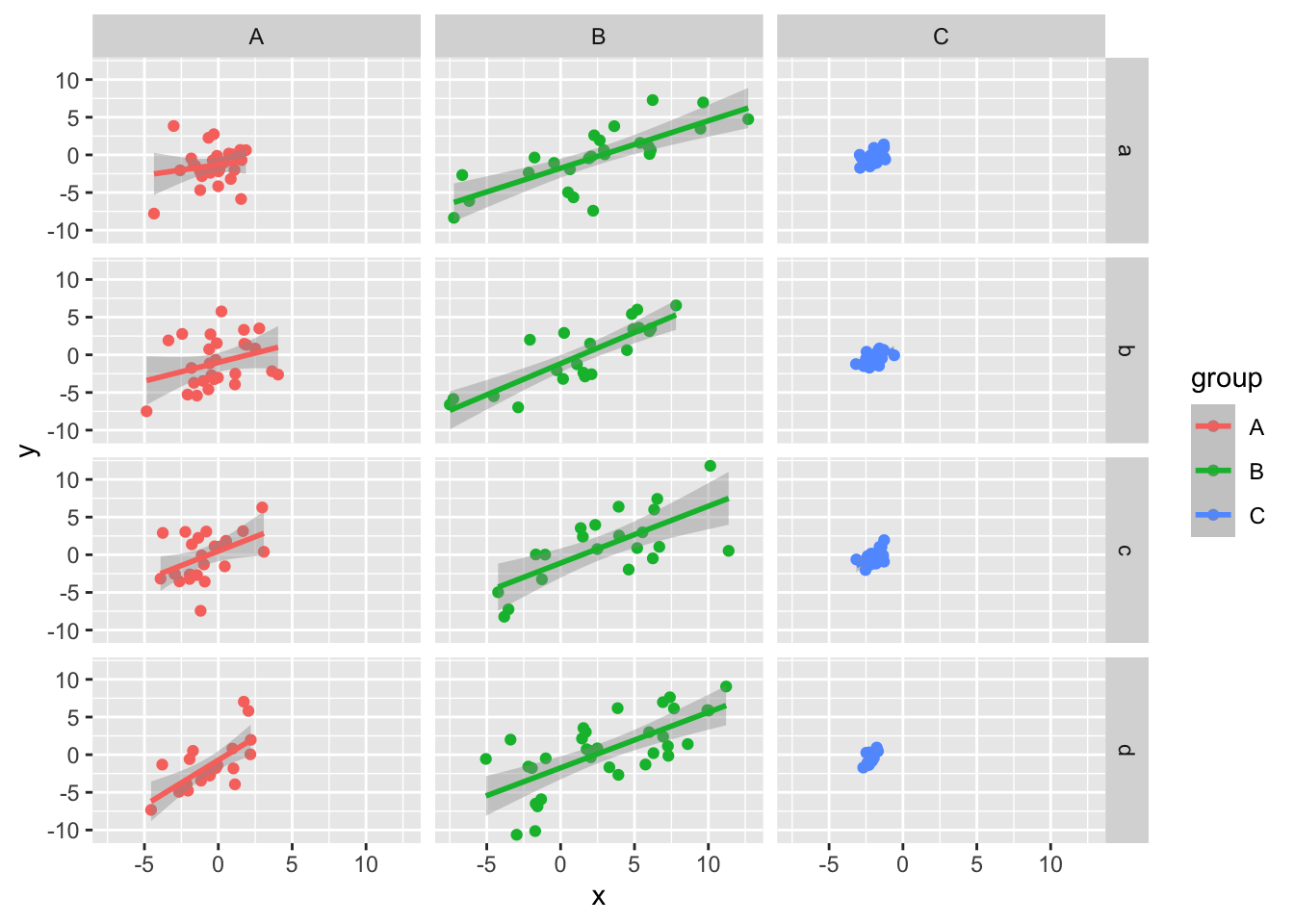
Create multiplot with each group as a facet and displayed in a different subplot,

ggplot(data = my_data,                                    # Multiplot using facet_wrap
       aes(x = x,
           y = y)) +
  geom_point() +
  facet_wrap(~ group)

Create multiplot with groups and subgroups as facets.

ggplot(data = my_data,                                    # Two grouping variables
       aes(x = x,
           y = y)) +
  geom_point() +
  facet_wrap(group ~ subgroup)

Create multiplot using the facet_grid function

ggplot(data = my_data,                                    # Using facet_grid
       aes(x = x,
           y = y)) +
  geom_point() +
  facet_grid(group ~ subgroup)

Same, but switch group and subgroup in the function.

ggplot(data = my_data,                                    # Using facet_grid
       aes(x = x,
           y = y)) +
  geom_point() +
  facet_grid(subgroup ~ group)

Add colour

ggplot(data = my_data,                                    # Mapping colors
       aes(x = x,
           y = y,
           col = group)) +
  geom_point() +
  facet_grid(subgroup ~ group)

Add regression lines

ggplot(data = my_data,                                    # Add layers to facets
       aes(x = x,
           y = y,
           col = group)) +
  geom_point() +
  facet_grid(subgroup ~ group) +
  geom_smooth(method = "lm")
`geom_smooth()` using formula = 'y ~ x'

Exercises

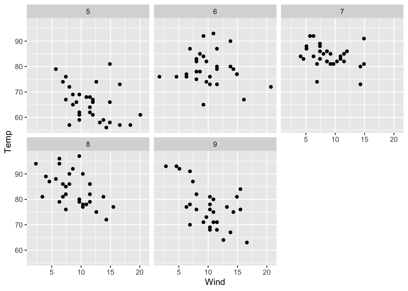
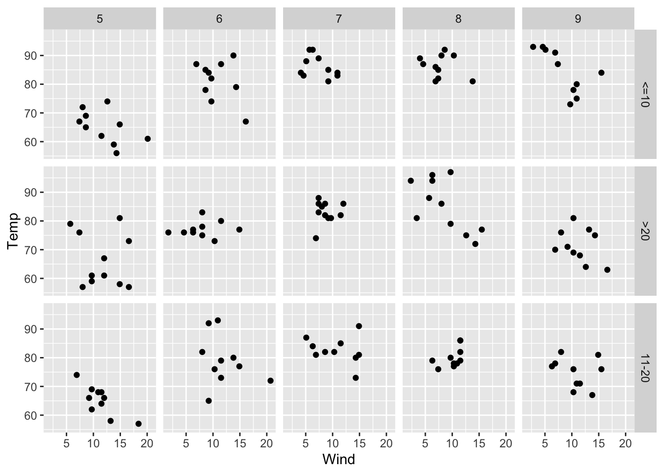
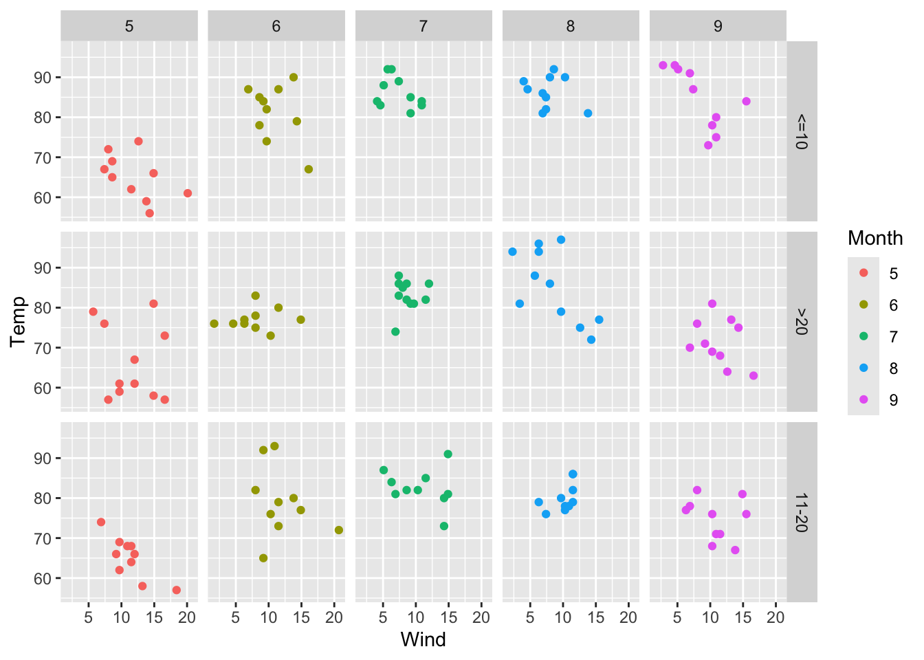
In this module, we will continue working with the airquality data set and introduce a new variable for grouping days into specific ranges. To prepare, we will install and load the dplyr and ggplot2 packages, convert the Month column to a factor class, and create a new factor variable DayRange that categorizes the Day column into ranges: <=10, 11-20, and >20.

data(airquality)   # Load example data
airquality$Month <- as.factor(airquality$Month)           # Convert Month to factor
airquality <- airquality %>%                              # Create Day ranges
  mutate(DayRange = factor(case_when(Day <= 10 ~ "<=10",
                                     Day >= 11 & Day <= 20 ~ "11-20",
                                     Day > 20 ~ ">20")))

Let’s now proceed with the exercises for this module:

  • Create a scatter plot mapping Wind to the x-axis and Temp to the y-axis. Use facet_wrap() to create separate panels for each Month.
ggplot(data = airquality,
   aes(x = Wind,
    y = Temp)) +
    geom_point() +
    facet_wrap(~ Month)

  • Extend the scatter plot by using facet_grid() to create a grid of plots with DayRange on the rows and Month on the columns.
ggplot(data = airquality,
   aes(x = Wind,
    y = Temp)) +
    geom_point() +
    facet_grid(DayRange ~ Month)

  • Add the col aesthetic to map Month to colors in the scatter plot, while maintaining the grid layout with facet_grid().
ggplot(data = airquality,
   aes(x = Wind,
    y = Temp,
    col = Month)) +
    geom_point() +
    facet_grid(DayRange ~ Month)