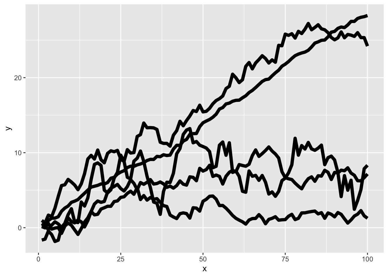
Exercises In this module, we will work with the CO2 data set, which contains measurements of carbon dioxide uptake in grass plants under different conditions. To prepare, we will install and load the ggplot2 package and load the CO2 data set. This data set provides both numeric and categorical variables, making it ideal for exploring different colors and themes.
Now, let’s move on to the exercises for this module:
Create a bar plot mapping Plant to the x-axis and uptake to the y-axis, using the fill aesthetic to assign default colors for each plant. Save the plot as my_ggp1 and display it.
Modify the bar plot my_ggp1 by changing the fill colors manually using scale_fill_manual(). Note that, in contrast to the lecture script, we use scale_fill_manual() instead of scale_color_manual() as we are now using the fill argument within the aes() function. Assign “orange” to Qn1 and “red” to Mn1.
Apply a discrete color palette using scale_fill_brewer() with the palette Set3.
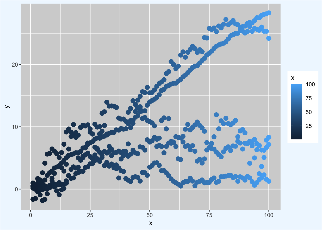
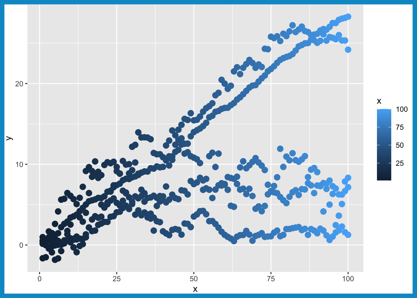
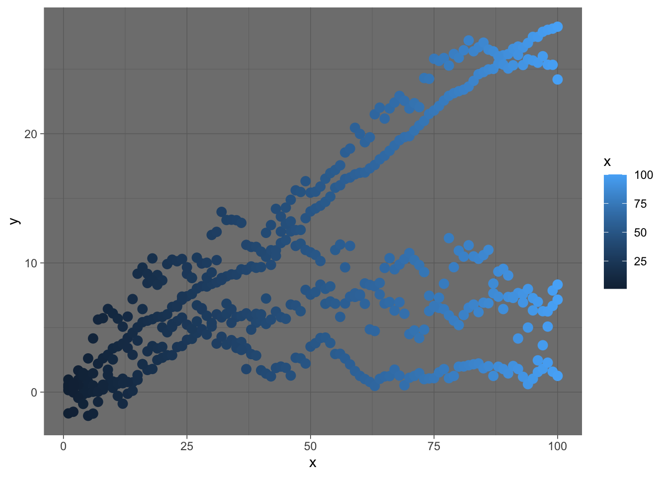
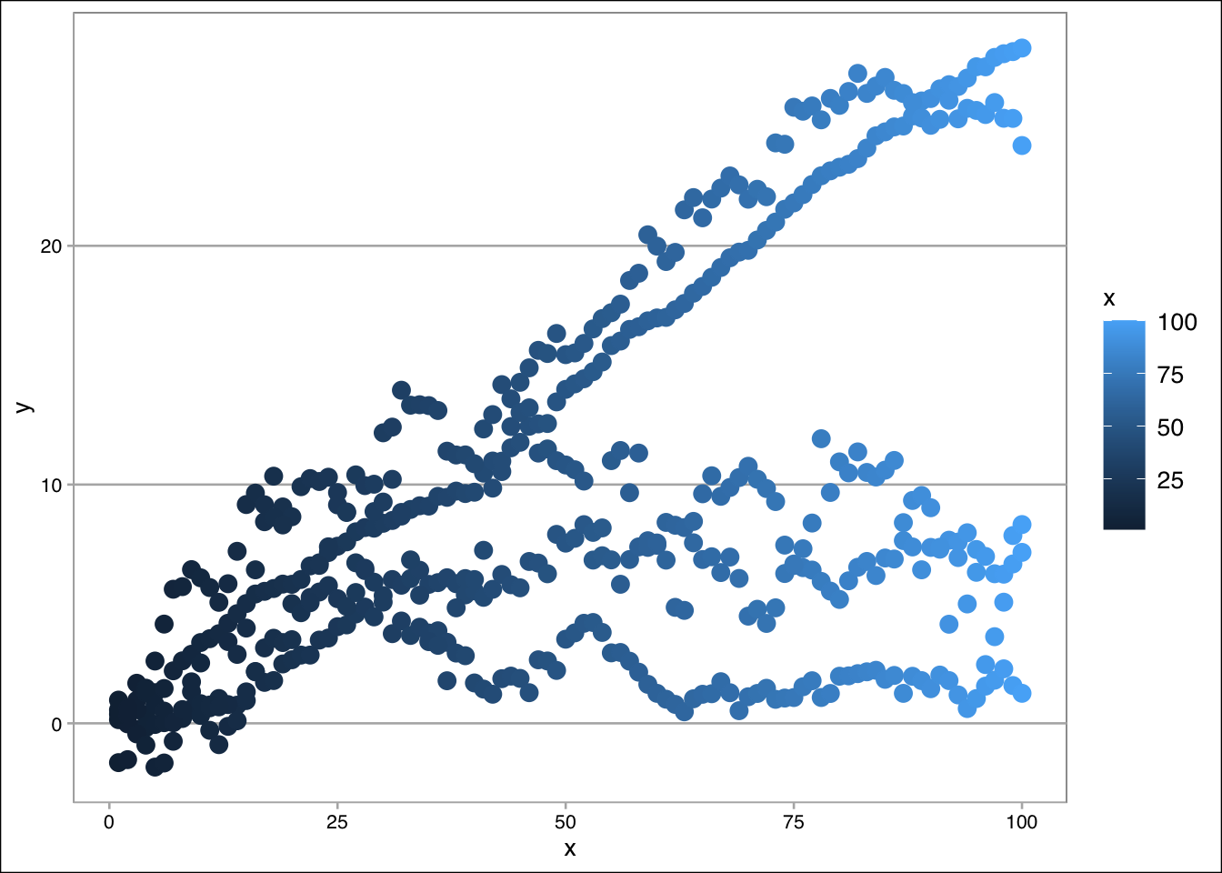
Create a scatter plot mapping conc to the x-axis and uptake to the y-axis, using color to represent conc. Save the plot as my_ggp2 and display it.
Modify the scatter plot my_ggp2 by applying a continuous color palette using scale_color_viridis_c() with the option C.
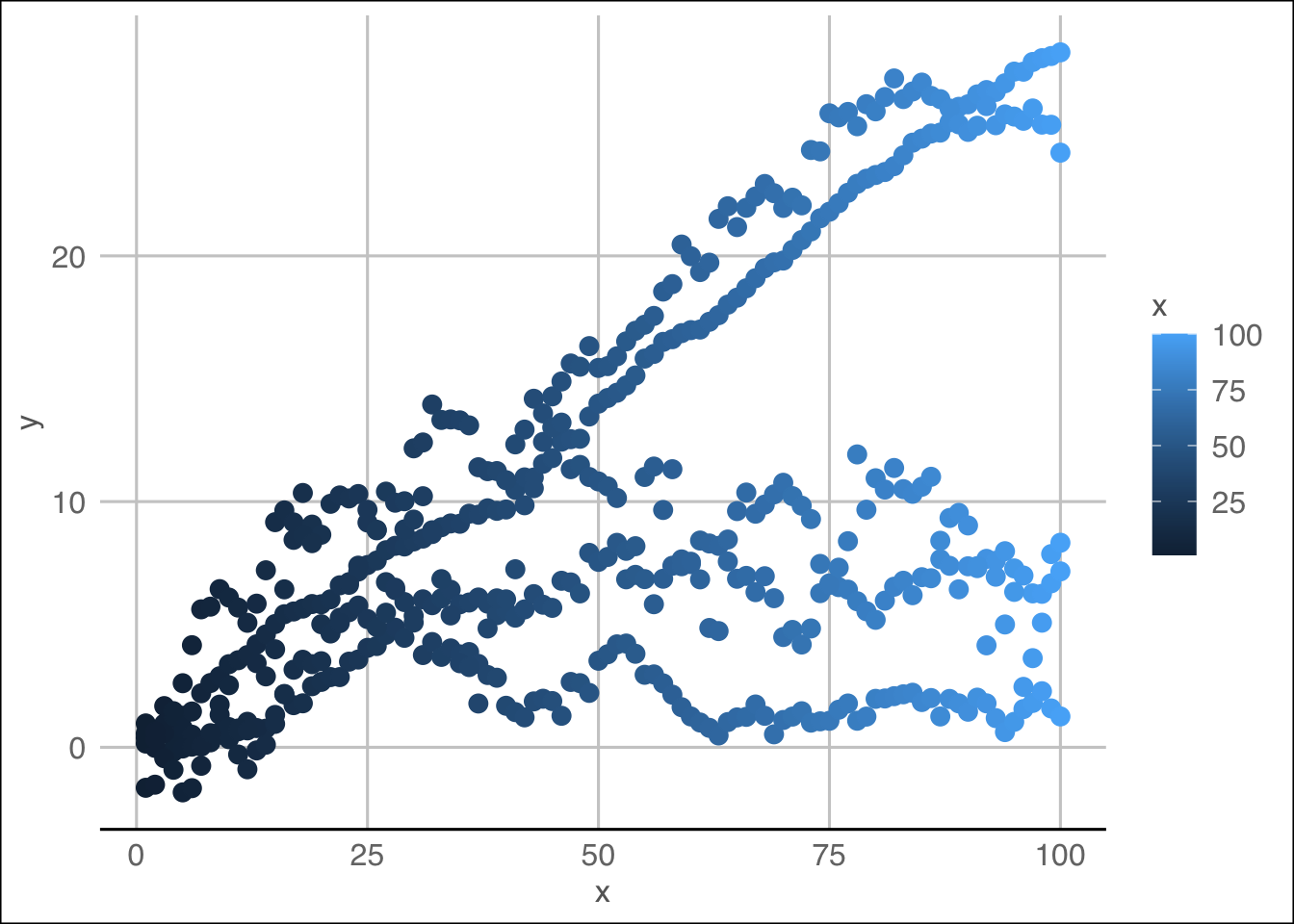
Enhance the scatter plot my_ggp2 by applying the theme_bw() theme.
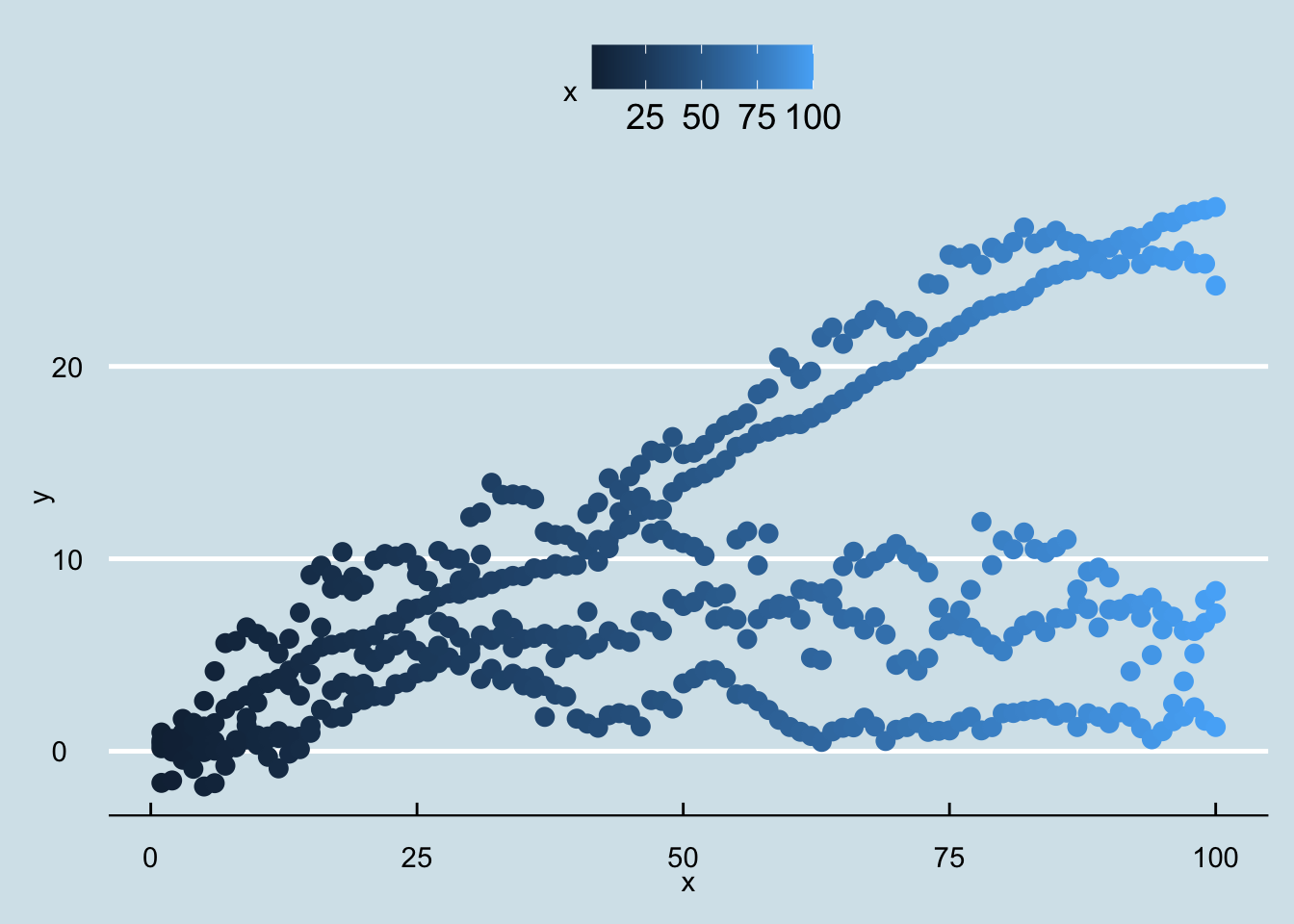
Install and load the ggthemes package, then apply the theme_economist() to my_ggp2.